Instructions
A step by step guide on how to customize this template to reflect your brand.
Changes made here will be global.
Customize Logo
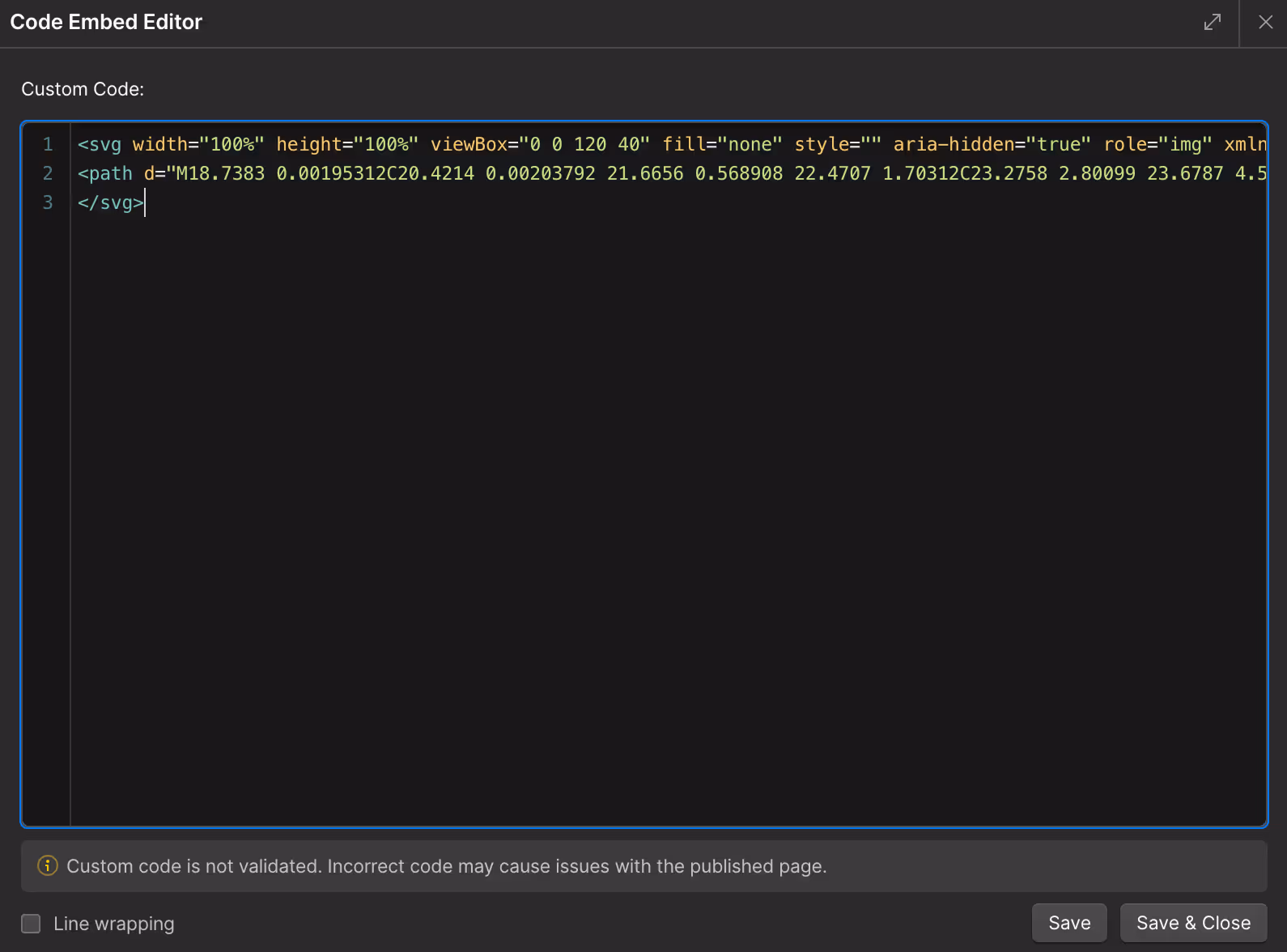
Logo SVG
If you have an SVG version of your logo, here's how to update it:
- Edit the Logo SVG component above
- Open the code editor
- Copy the SVG code from Figma
- Paste and replace the SVG code
- Set width="100%" height="100%"
- Set fill="currentColor"
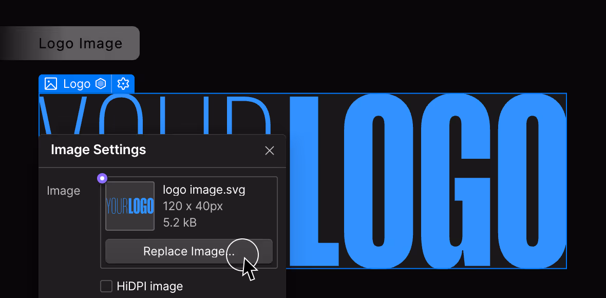
Logo Image

Alternatively, you can upload the image version of your logo. Here's how to update the dark version:
- Edit the component above
- Upload and replace the image
- Image formats: png or svg with transparent background
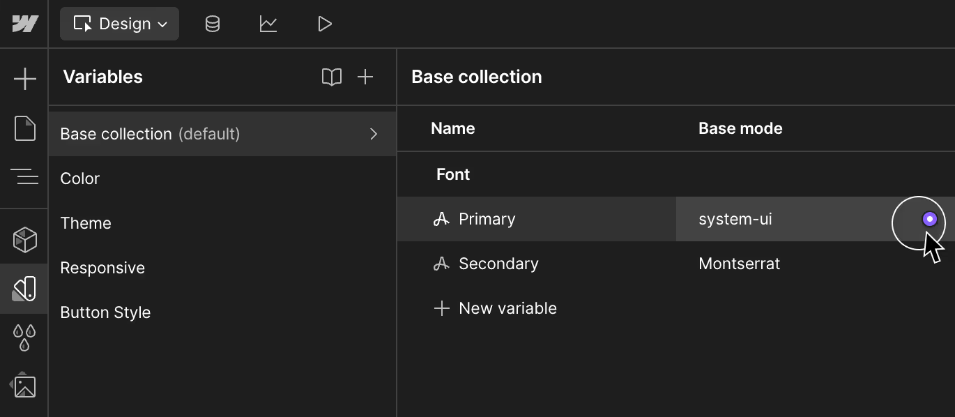
Customize Font
Primary Font
Anybody
Secondary Font
HUMANE
- To customize both fonts, go to the Variables panel (V)
- Select the default tab
- Choose from any existing fonts or upload your own fonts
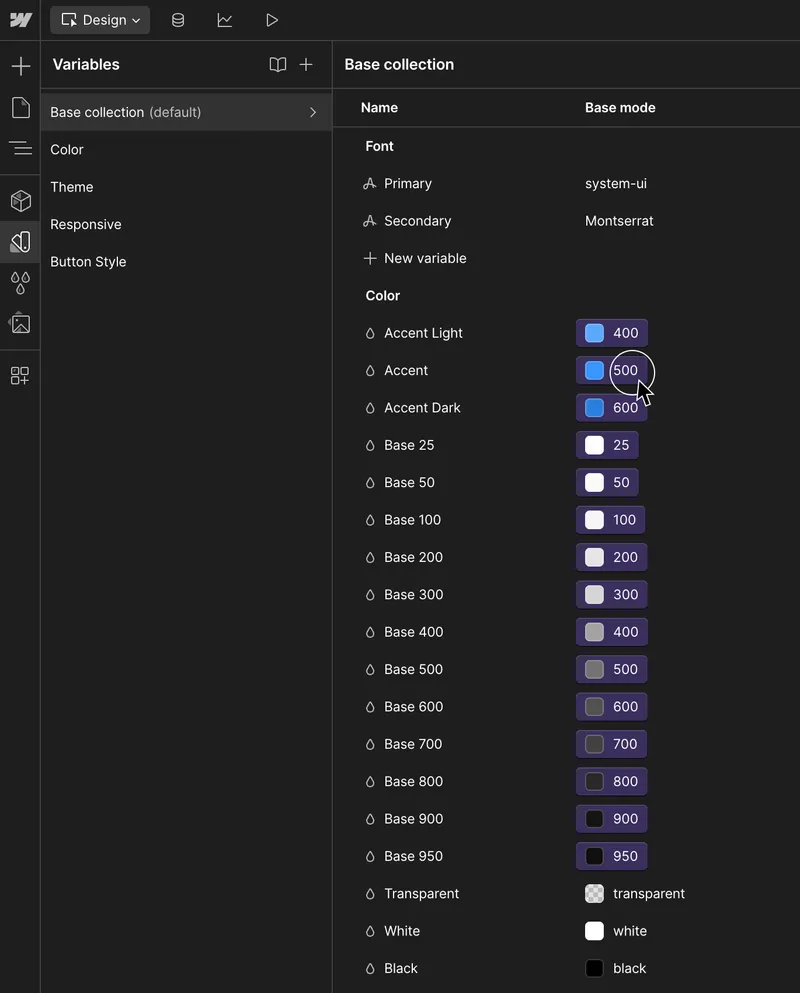
Customize Color
Accent Color
Accent color is a contrasting color used to highlight important elements. Accent colors are used sparingly to draw attention to specific parts of a design, like buttons, links, or sections of a website.
Base Color
Base color is a the main color and is used as default background color on all pages.
Color
The Color tab consists of all set of color available for use in the project.
- To customize color, go to the Variables panel (V)
- The default tab is where you can customize the Accent and Base color
- You can add more color sets in the Color tab
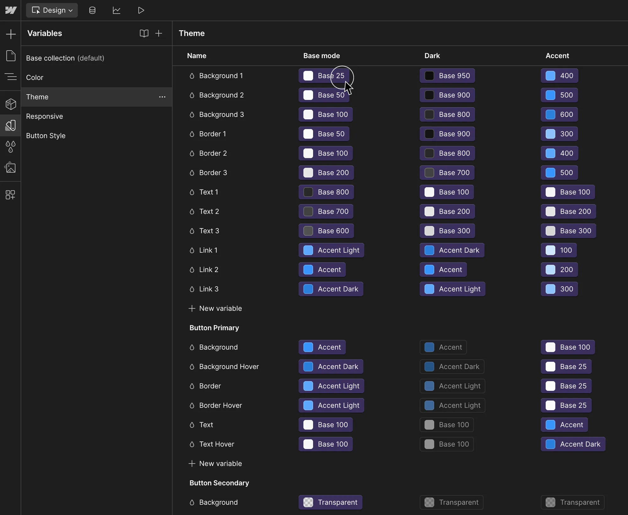
Theme
Theme allows you to switch color mode easily in Section Component.
- To customize, go to the Variables panel (V), then go to Theme tab
- You can customize Base, Light and Dark mode
- You can also add more modes here
*ProTip: When customizing Theme, Components page helps you visualize how changes affects each component
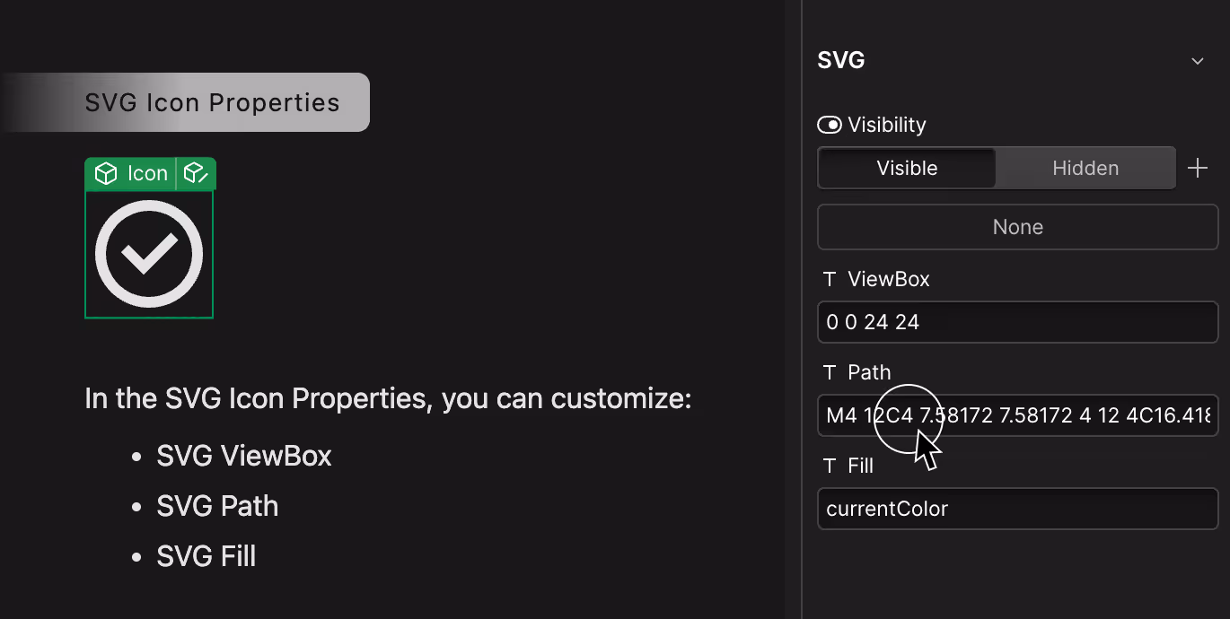
Customize SVG Icon
SVG Icon Properties
In the SVG Icon Properties, you can customize:
- SVG ViewBox
- SVG Path
- SVG Fill
To copy SVG Properties from Figma:
- In Figma, select the Icon
- Right click > Copy/Paste as > Copy as SVG
- While in Figma, paste into a text block
- Copy & paste each individual properties you'd like to replace